Fixing time.
As promised i have been working on fixing some stuff and bringing the Interface up to date with older Nirans Viewer builds, i think you will be happy with the new(old) stuff.
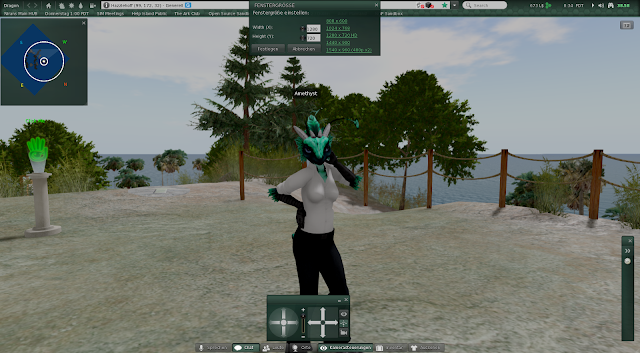
The Navigationbar has been overhauled alot, the balance thingy shouldnt overlap the rest anymore, the balance icon has been changed and our lovely quick Windlight buttons are back aswell as my much needed quick Searchbar.
People was bugging me extremly because it simply looked way too grey and misaligned, space wasting and broken, i fixed the avatarlistitems, included the "always show permissions" fix i made and generally changed everything a bit here and there to make People look like a nice and clean panel.
![]()
The RegioLight or "use region time" button and the "use daycycle instead of fixed sky" checkbox should now work as intended, they might bug out a little bit at start but, going to another SIM and clicking stuff here and there a bit, switching it on/off should fix it once and for all (might have been just me beeing stupid).
Color Correction in graphic prefs can now be clicked and SHOULD BE if you use Tone Mapping because otherwise it will just look like a bright grey/white broken... thing. Remember that my pictures are all made with Tone Mapping and Color Correction, it does not look like that? Then you missed something.
Some information about that can be found in previous post comment sections
Maddy also showed me that the minimap looked broken. I tell you, NOT ANYMORE!
With the recent changes you can now also move your floaters over the Navigationbar instead of just below it :P
![]()
Not much has been done here as the major graphical changes have been done in the previous beta already but hey know what? You had no options to finetune SSAO and Shadows in any way, that means you still use the defaults which in turn means that you wont need a settings redo to get those new settings i made to fix too sharp Shadows/SSAO. Life can be so easy if you cant break anything.
enjoy,
Niran.
2.2.3 Beta
added quick Windlight and browser icons to Topbar
added quick Search field to Topbar
added a whole bunch of customization Debugs (non functional)
added Minimap chat range rings
added missing icons for Windlight editors
added some missing inventory art assets
fixed Shadows and SSAO beeing way too crisp causing Shadow/SSAO pixelation
fixed Avatarlistitems breaking whenever someone has voice
fixed Minimap background color
fixed a crash when opening water preset editor
fixed Color Correction beeing not clickable
fixed Block list bottom button panel layout bugging out
fixed a crash when opening "Set Window Size" floater
fixed set window size calculation for correct resolution changes
fixed RegioLight and "use DayCycle instead of fixed Sky" buttons
fixed "Click this to refresh your L$ balance" panel overlapping half of the navigationbar
merged CHUI including fixes to allow quitting the Viewer on first try now
changed Topbar layout and brought it up to date with the old style layout
changed People floater layout and made it look nice and clean
changed some loadingscreen tips to better fit the new Viewer
changed background color for all lists to 50% alpha black
changed toolbar positioning a bit so floaters snap closer to the Navigationbar
As promised i have been working on fixing some stuff and bringing the Interface up to date with older Nirans Viewer builds, i think you will be happy with the new(old) stuff.
User Interface:
The Navigationbar has been overhauled alot, the balance thingy shouldnt overlap the rest anymore, the balance icon has been changed and our lovely quick Windlight buttons are back aswell as my much needed quick Searchbar.
People was bugging me extremly because it simply looked way too grey and misaligned, space wasting and broken, i fixed the avatarlistitems, included the "always show permissions" fix i made and generally changed everything a bit here and there to make People look like a nice and clean panel.

The RegioLight or "use region time" button and the "use daycycle instead of fixed sky" checkbox should now work as intended, they might bug out a little bit at start but, going to another SIM and clicking stuff here and there a bit, switching it on/off should fix it once and for all (might have been just me beeing stupid).
Color Correction in graphic prefs can now be clicked and SHOULD BE if you use Tone Mapping because otherwise it will just look like a bright grey/white broken... thing. Remember that my pictures are all made with Tone Mapping and Color Correction, it does not look like that? Then you missed something.
Some information about that can be found in previous post comment sections
Wikipedia says:
"Tone mapping is a technique used in image processing and computer graphics to map one set of colors to another in order to approximate the appearance of high dynamic range images in a medium that has a more limited dynamic range."
As far as i understand this means translated in common language:
"Tone Mapping is a Post Process Effect that aims at 'equalizing' or 'normalising' colors to a good medium"
You can notice this effect on the sky. The reason i always keep saying that Tone Mapping is supposed to be used with Color Correction and vise versa is that Color Correction how i configured it aims at adding contrast to the picture without destroying the original Tone Mapping effect which could be described as "smoothing" colors. Basically Color Correction adds back in the darkness and brightness but keeps the 'normalised' colors for them, as example you have a bright blue, a normal blue and a dark blue (a sky as example), Tone Mapping 'normalises' these colors by reducing the range between these colors, thus making the bright blue just a 'a bit brighter blue', the normal blue becomes a bit more colorfull and the dark blue becomes a 'a bit darker blue' that will result in a "duller" image but also in a smoother color transition which i think is very important for a nice picture, no one wants color banding, Color Correction will now find and correct other parts of the image like very dark colors (dark grey to black) and makes them "dark" , really dark compared to the overbrightened image without Color Correction, you will now have a combination of a smooth transition between colors and still maintain a "wide" range between colors in terms of having dark and bright stuff.
Maddy also showed me that the minimap looked broken. I tell you, NOT ANYMORE!
With the recent changes you can now also move your floaters over the Navigationbar instead of just below it :P
Rendering:
Not much has been done here as the major graphical changes have been done in the previous beta already but hey know what? You had no options to finetune SSAO and Shadows in any way, that means you still use the defaults which in turn means that you wont need a settings redo to get those new settings i made to fix too sharp Shadows/SSAO. Life can be so easy if you cant break anything.
enjoy,
Niran.
Changelog:
2.2.3 Beta
added quick Windlight and browser icons to Topbar
added quick Search field to Topbar
added a whole bunch of customization Debugs (non functional)
added Minimap chat range rings
added missing icons for Windlight editors
added some missing inventory art assets
fixed Shadows and SSAO beeing way too crisp causing Shadow/SSAO pixelation
fixed Avatarlistitems breaking whenever someone has voice
fixed Minimap background color
fixed a crash when opening water preset editor
fixed Color Correction beeing not clickable
fixed Block list bottom button panel layout bugging out
fixed a crash when opening "Set Window Size" floater
fixed set window size calculation for correct resolution changes
fixed RegioLight and "use DayCycle instead of fixed Sky" buttons
fixed "Click this to refresh your L$ balance" panel overlapping half of the navigationbar
merged CHUI including fixes to allow quitting the Viewer on first try now
changed Topbar layout and brought it up to date with the old style layout
changed People floater layout and made it look nice and clean
changed some loadingscreen tips to better fit the new Viewer
changed background color for all lists to 50% alpha black
changed toolbar positioning a bit so floaters snap closer to the Navigationbar